Tracking Truck Migration Across 50 States: What 9.5 Million Inspections Reveal
We tracked where 9.5M trucks were registered vs. inspected. The result: a seasonal migration map of US freight - reefers chasing the harvest, capacity retreating south in winter.
Every time a commercial vehicle rolls through a weigh station or gets pulled over for a roadside inspection, the FMCSA records where the truck was registered and where it was found. Do that 9.5 million times over three and a half years, and you get something remarkable: a living map of how trucking capacity moves across the country.
We built an interactive flow map that animates these patterns month by month. Here's what the data tells us.
February Is Dead. May Is Alive.
The single clearest signal in the data is the annual volume cycle. In May, we see 253,000 inspections involving 108,000 distinct carriers — the system running at full tilt. By February, that drops to 177,000 inspections and 79,000 carriers. That's a 43% swing from peak to trough, and it repeats like clockwork every year in our dataset.
But the interesting part isn't just that there are fewer trucks in winter. It's where the remaining trucks go.
Winter Pushes Trucks South
We computed a Herfindahl-Hirschman Index (HHI) for each month — a standard measure of market concentration — using every state's share of national inspection volume. The results paint a clear picture:
- September is the most geographically dispersed month (HHI 0.048). Capacity spreads across 34 states, each holding at least 1% of national activity. The top 5 states account for just 36% of the total.
- January is the most concentrated (HHI 0.057). The top 5 states now hold 40% of all activity, and the number of meaningfully active states shrinks.
What's happening is a seasonal migration. As freight volumes drop in late fall, carriers physically relocate toward Sun Belt states where work is still available. When spring arrives, they fan back out. If you play the seasonal animation on our map, you can watch this happen in real time — the arcs bloom outward in spring and retreat inward come winter.
The Reefer Calendar
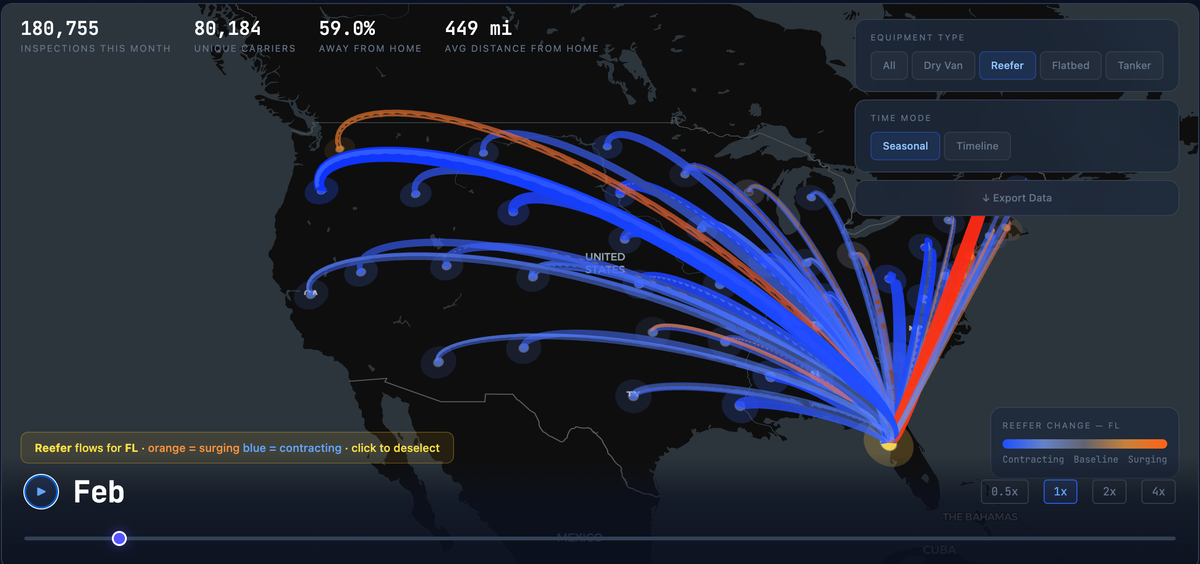
The most vivid equipment-specific pattern belongs to refrigerated trailers. Reefers don't just follow freight — they follow the harvest.
Arizona is the poster child. In January, reefer trailers make up 25% of all inspections in the state — driven by the Yuma lettuce and winter vegetable season that supplies much of the country's fresh produce from November through March. By September, that share falls to 19%. A 6-point seasonal swing, statistically significant every year we measured it.
Other agricultural states have their own reefer rhythms:
- Idaho hits 26% reefer in March (potatoes, dairy), dropping to 18% by June
- Washington peaks at 18% in the winter months (cold-storage apple and fruit exports), falling to 15% in summer
- Georgia shows a subtle July bump to 9% — peach season — before pulling back in the fall
These patterns become vivid on the map when you select the Reefer equipment filter. Routes that are surging above their seasonal baseline light up orange; those contracting turn blue. The result is a visual fingerprint of American agriculture moving through the freight network.
Dry van trailers, by contrast, hold remarkably steady at 40–49% share nationally regardless of season. Flatbed shows modest seasonality tied to construction activity in northern states.
Three States Run the Show
Not all states contribute equally to the national flow network. When we rank states by total outbound capacity:
- Illinois — the undisputed hub. Chicago's position as the national freight crossroads means Illinois-domiciled carriers show up in inspections everywhere. It generates more outbound flow than any other state.
- Texas — the southern anchor. Heavy flows into New Mexico (1,159 inspections/month on the TX→NM corridor alone), Louisiana, Arkansas, and California.
- California — dual role. It's the #3 origin but flips to the #1 destination. Carriers from Ohio, Illinois, Washington, and Texas all converge on California, making it the country's largest inbound capacity magnet.
The single busiest lane? California → Arizona, averaging 1,224 inspections per month with over 1,000 unique carriers. The CA→NM and TX→NM corridors round out the top three — all I-10 and I-40 freight, connecting the West Coast to the interior.
Bigger Fleets Travel Further
We segmented carriers by fleet size and found a near-linear relationship between how many trucks a company operates and how far those trucks roam from home.
| Fleet Size | Avg Distance from Home | % Inspections Out-of-State |
|---|---|---|
| Owner-operators (1 truck) | 376 mi | 48% |
| Small fleets (2–5) | 335 mi | 47% |
| Mid fleets (6–20) | 333 mi | 50% |
| Large fleets (21–100) | 406 mi | 59% |
| Mega fleets (100+) | 668 mi | 79% |
The seasonal effect on distance is subtle but present: owner-operators venture slightly further in January (376 mi) than July (371 mi), likely chasing available freight during the slower months. Mega fleets show less seasonal variation, suggesting their networks are more structurally fixed.
How We Built This
The underlying dataset is 9,501,412 roadside inspection records from the FMCSA, spanning August 2022 through February 2026. Each record tells us a carrier's DOT number, domicile state, inspection state, date, trailer type, and fleet size.
We define a "flow" as any inspection where the carrier's home state differs from the inspection state. Seasonal baselines are the average flow for each origin-destination pair across all available years for each calendar month. Deviations measure how much a given month's flow exceeds or falls short of that baseline — the orange and blue coloring on the map.
Equipment shares are the fraction of inspections at a given state and month involving each trailer type. We test seasonal significance using chi-squared tests against each state's annual baseline distribution.
Geographic concentration uses HHI computed from each state's share of national inspection volume. Perfect uniform distribution across 50 states would yield an HHI of 0.02; values above 0.05 indicate meaningful concentration.
Explore the data yourself: Our interactive carrier flow map lets you toggle between seasonal and timeline views, filter by equipment type, and click any state to see its specific inbound/outbound patterns. The underlying dataset is available for export.
Built by the data team at AlphaLoop — carrier intelligence for freight brokers, insurers, and technology companies.